.png)
Final Music Magazine
This is my final Music Magazine. I used Joomag to create this interactive representation of my music magazine.
Construction - Double Page Spread
Again I made my double page spread in Adobe Photoshop CC 2014. I started by creating the canvas size to 420x297 as this is the dimensions of a double page spread. I added my picture in the background and used the objects to created a bar down the left hand side, The bar has been rotated to give a more indie/alternative look. I wanted the article to match the angled edge of the grey bar, to do this I used the Envelope Distort Tool to bind the text box to the edge of the angled bounding box, formatting the text to justify meant the text was evenly distributed and looked even.
Construction - Contents Page

Making my contents page I used Adobe Photoshop CC 2014. The whole page is made up of a total of 45 layers.

To make the contents First had to decide which stories I wanted to be included. This was difficult as I needed to think of 8 headlining stories that had names that fit the style of magazine that I am going to go for. Each story had to have a description that also matched the title and fit with the codes and conventions of an alternative magazine.
From what I have seen in other music magazines on the inside if the cover there is normally an advert for either a festival or other music event, because of this I decided to make my own festival advert to put in this space. I created the advert in Adobe Illustrator CC 2014 so the entire advert was made in vector, however it had to be converted into Rasta so that I could implement it next to the contents page within Photoshop. Here is the final advert and contents page for my Music Magazine

Construction - Front Cover
Creating my final front cover was a fun process as I got to use lots of different pieces of software, including Adobe Photoshop CC 2014 and Adobe Illustrator CC 2014.


I first started with my background photo and added my mast head in white at the top left as this is where mastheads traditionally go.
I then added the band name across the middle of the front cover and a quote on the top left. I also added a bar code as this is something that is found on most magazines on the front cover. I took extra time to make the bar code functional. If you scan the bar code on a mobile app it gives the URL to this blog.

I felt like the front cover wasn't balanced enough and needed a splash on the top left hand corner, I also wanted to include the video thumbnail in the bottom corner.

This is my final front cover of my Music Magazine.
Band Identity - Editing Photos
To edit all the photos in my Music Magazine I will be using Adobe Photoshop CC 2014. This lets me change all elements of the photo to give the exact look that I want.Front Cover
Here is the original photo that I am wanting to use on my front cover:

I have cropped the photo to the correct size of 210 x 297 to fit a4 paper and positioned the photo to where I want it. I also used the Patch Tool and the Spot Healing Tool to touch up the skin of my model as codes and conventions of Music Magazines have flawless skin on all of their models.

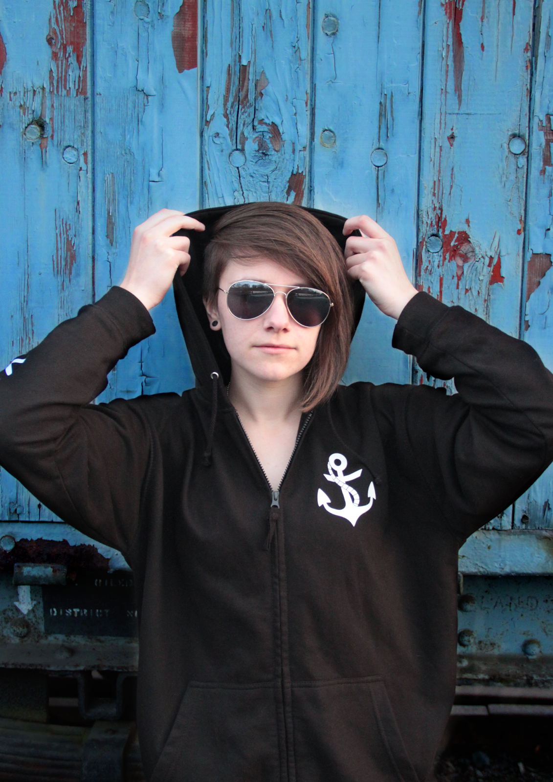
After this I added a blue layer over the image and dropped the opacity to 20%, Changed the Hue And Saturation to boost the Blue colours and adjusted the Levels to deepen the colour contrast. I then grouped the blue layer, hue and saturation layer and the levels layer into a folder and used a Layer Mask to only adjust the background of the image as I only wanted to darken the blues of the background.
I then wanted to make the model darker to give more contrast against the background, to do this I edited the Levels and created a Layer Mask over the image to only edit the model, similar to what I did previously on the background.

On my front cover I want to have a small thumbnail that looks like a frame from a music video. To do this just took a basic photo and added a play button over it in Photoshop, reducing the opacity giving it the feel that is a video on a social media site

Contents Page

Editing this image didn't take much effort as the RAW photo had really nice white balance and lens flare. All I did to this picture is soften the exposure and touched to the models skin like in the previous photo using the Spot Healing Tool and the Patch Tool.
The image has also been slightly cropped as not all the background was necessary.
Double Page Spread
Making the double page spread was much more difficult because I wanted to merge two different images, taken from two different locations.
Here are the two images that I wanted to merge:


First of all I had to use the Lasso Tool to cut out the phone box from its background. I had issues when it came to the feet of the model as the raw photo had not captured the feet properly. I had to use the Clone Tool and the Eraser Tool to try and edit them back in.

I then overlay the phone box on the picture of the train station. I had to change the perspective of the phone box by using the Skew Tool, Distort Tool, Perspective Tool and the Warp Tool to achieve this. Then I started to edit the photo... to edit the photo to how I like it I used 18 layers which can be seen below.

Here is the finished photo ready for the main article:

Subscribe to:
Posts (Atom)


